Published guidance · ethereum.org
Design guidance for ethereum.org
Two articles for the ethereum.org developer docs, seven usability heuristics for web3 and a best-practice guide to exchange design, with a free Figma wireframe kit.
- Organisation

- Published in
- ethereum.org developer docs, Design and UX, under Getting Started
- Role
- UX Contributor
- When
- May–July 2024 · Remote
- Also listed
- My Web3 UX Design Handbook, as further reading on the same page
- 2articles in the ethereum.org developer docs
- 7usability heuristics written for web3
- 24diagrams, drawn for the articles
- 1free wireframe kit on Figma Community
What I made
The main reference site for Ethereum builders
In 2024 I wrote the design guidance in ethereum.org’s developer documentation. Ethereum.org is the main reference site for anyone building on Ethereum, and its developer docs sit alongside the pages on smart contracts, nodes and networks. My two articles are the guides listed under Getting Started on its Design and UX page: one sets out usability heuristics for any web3 app, the other works through the screen almost every DeFi user has seen, the token swap.
I drew all the diagrams for both, and built a free Figma wireframe kit for teams to try the ideas themselves.
- Article · ethereum.org
7 heuristics for Web3 interface design
Usability heuristics for any web3 app, to use alongside Nielsen’s.Read on ethereum.org - Article · ethereum.org
DEX design best practices
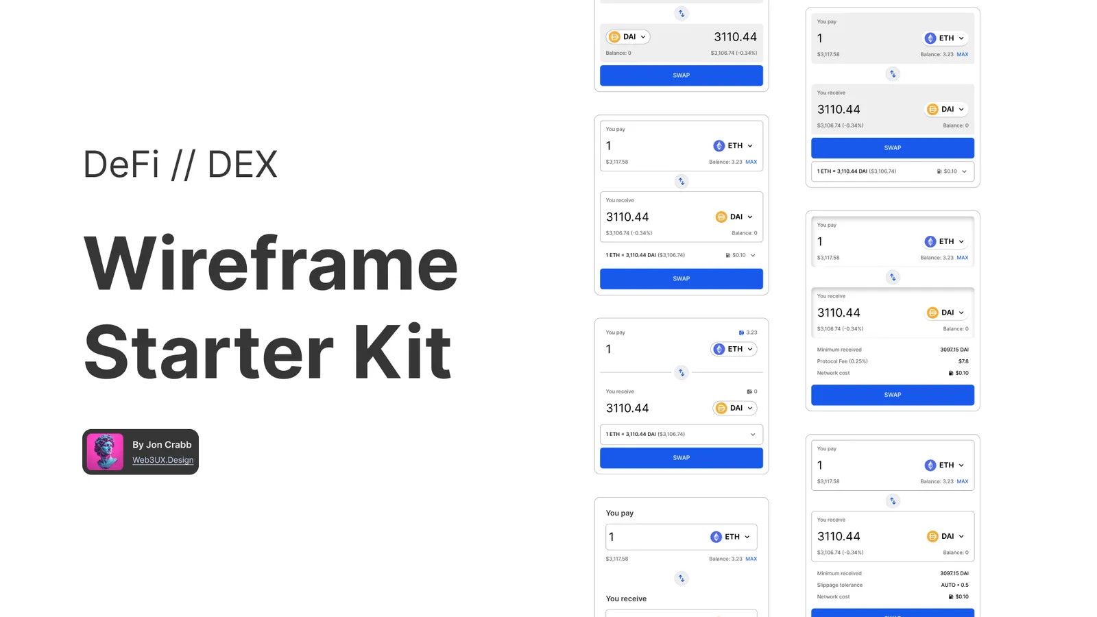
The token swap screen, worked through part by part.Read on ethereum.org - Figma Community
DEX Wireframes Kit
Every part in three styles, with eight example layouts.Open in Figma
Part 1
Seven heuristics for web3
Jakob Nielsen’s ten usability heuristics are the standard checklist for judging an interface. They still apply in web3, but they were written before a product could depend on a wallet that is a separate app, transactions that take time to confirm, several networks at once, and code that holds people’s money. The article adds seven heuristics for those situations, each with tips and a worked example, to be used alongside Nielsen’s.
Feedback follows action
It should be obvious when something has happened, or is happening. Blockchain transactions can take a while to confirm, and without feedback people cannot tell whether anything is happening at all. State waiting times, and when a process has several steps, show each one.
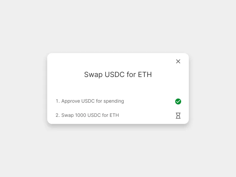
Completed and Pending states visible. Security and trust are baked in
Safety is often the first thing users worry about, so trust has to be designed in throughout, not added at the end. List audits prominently, flag risks, including those of any protocols the app depends on, and remember that things outside the interface, such as whether the team is public, shape how safe the product feels.
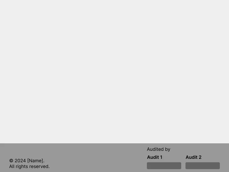
Audits listed in the site footer. The most important info is obvious
People anchor on one number when deciding: in DeFi, usually the yield on a savings product or the loan-to-value on a lending app. Research will show which it is. Make that number big and everything else small, because people scan rather than read.
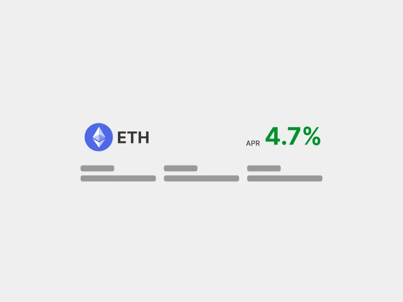
APR is the most important number on most DeFi apps. Clear terminology
Someone who comes to DeFi wanting to save some money meets mining, farming, staking, emissions, bribes, vaults, lockers, epochs and protocol-owned liquidity. Use the plainest words available, follow conventions, and never invent a term for your own project.
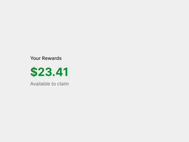
Rewards labelled in plain words and shown in dollars, even when they are paid in another token. Actions are as short as possible
Group steps together, in the interface and in the smart contract, so people do not have to move around the app or leave it to finish a common task. Combine approvals with the action they belong to.
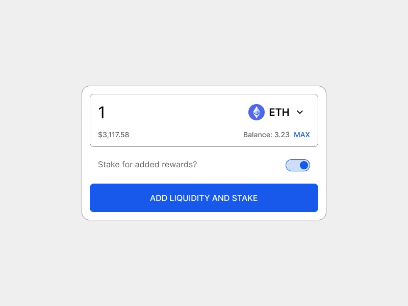
One switch combines two transactions, saving time and fees. Network connections are visible and flexible
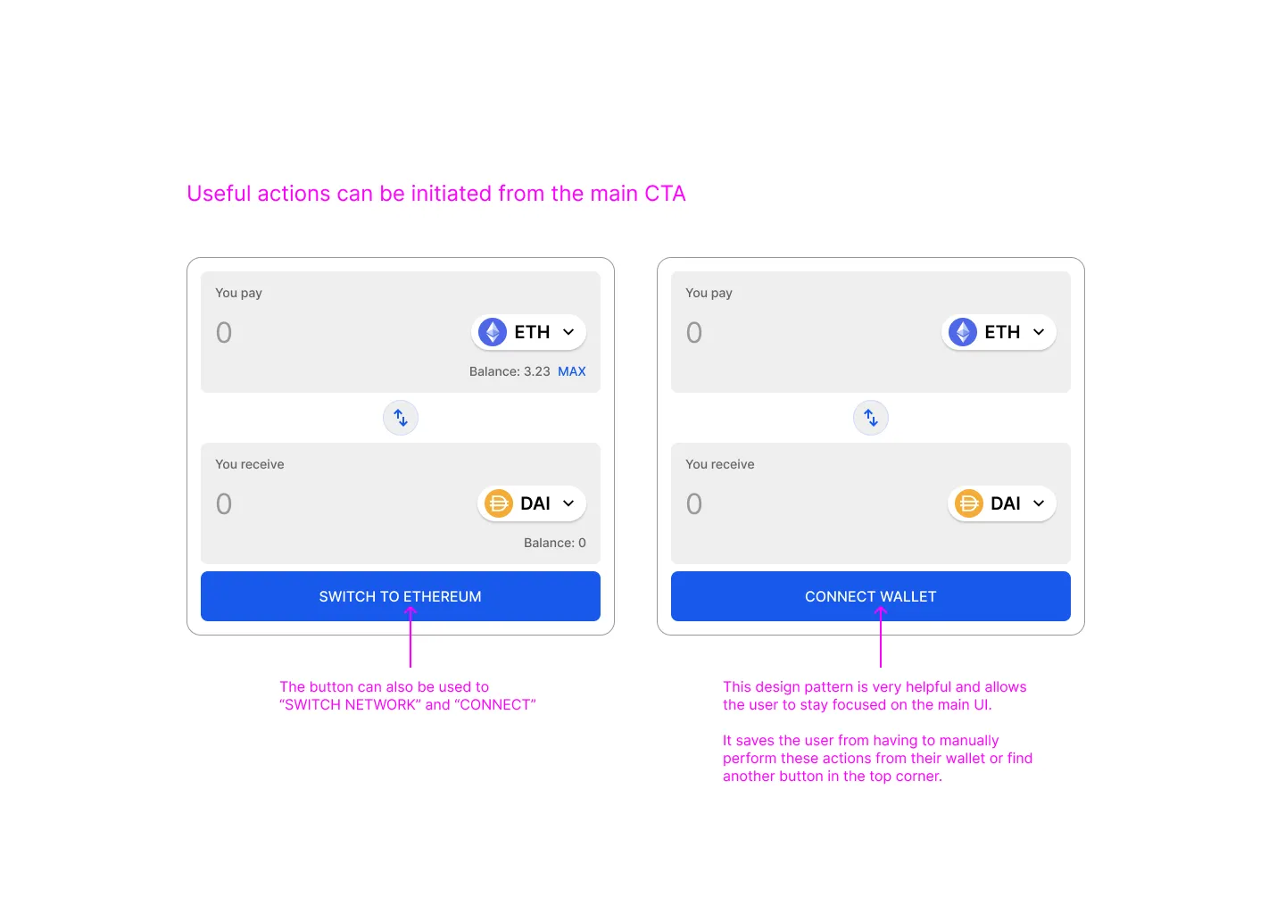
Show which network the user is on and let them change it without opening their wallet. Show as much of the app as possible before a wallet is connected.
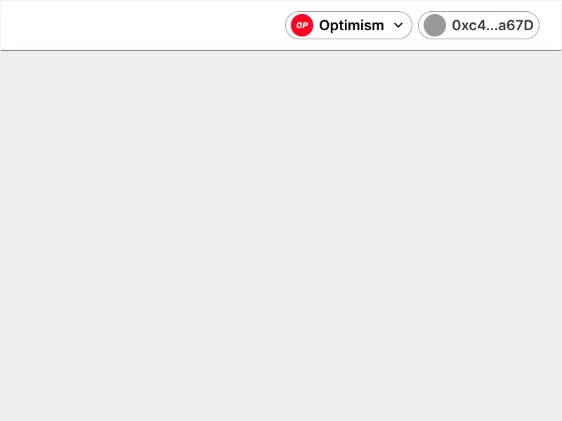
User is clearly connected via Optimism. Control from the app, not the wallet
In web3 you start an action in the app and confirm it in a separate wallet, and people feel uneasy when the two do not join up. The app should tell users everything they need and let them do everything from there: show the status of each transaction, keep a history, and turn the main button into a shortcut when something is in the way.
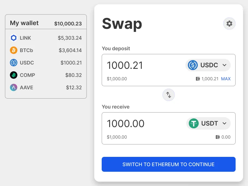
The main CTA prompts the user to switch networks.
Part 2
DEX design best practice
Since Uniswap launched in 2018, hundreds of decentralised exchanges (DEXes) have appeared across dozens of blockchains, and nearly all of them look alike. That is Jakob’s Law at work: people spend most of their time on other sites, so they expect yours to work the same way. Years of exchanges competing for the same users amount to a giant live test, and a best practice has emerged from it. The article sets out what to include in a swap screen, how to make it as usable as possible, and where there is room to make it your own.
Every example in the article is a wireframe I made for it, based on real exchanges.
What has to be on the screen
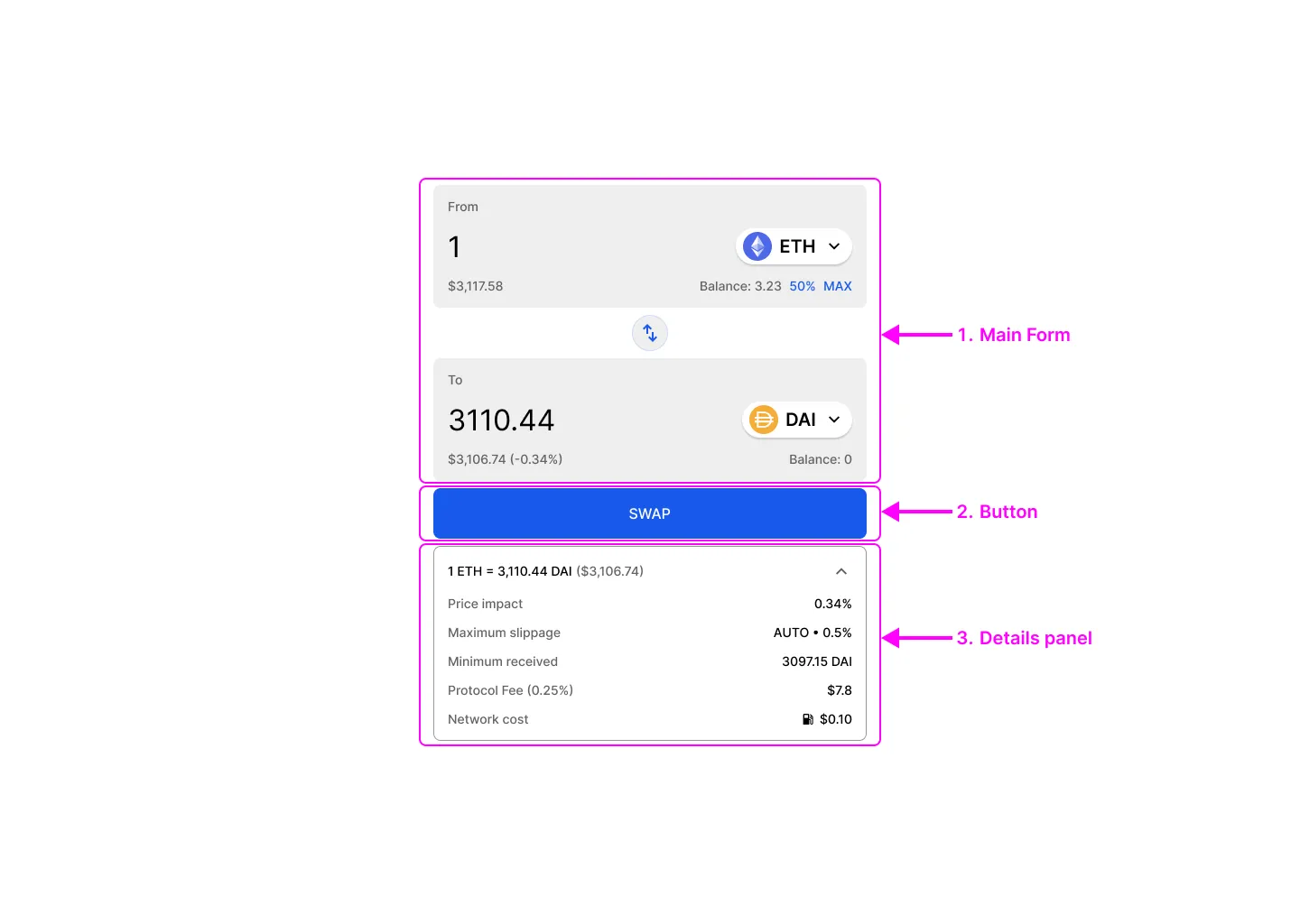
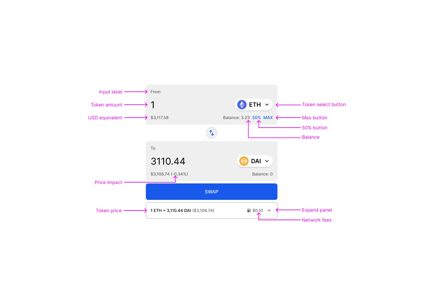
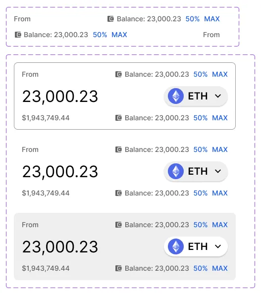
A swap screen has three parts: the main form where you choose tokens and amounts, the button, and a panel of details. The main form has room for four pieces of information, one in each corner of each input. Four belong there: the balance in your wallet, a Max button, the value in dollars, and, on the token you receive, the price impact of your trade.
Early exchanges often left out the dollar value. People still think in their own currency, so any web3 product should show it.
What can go
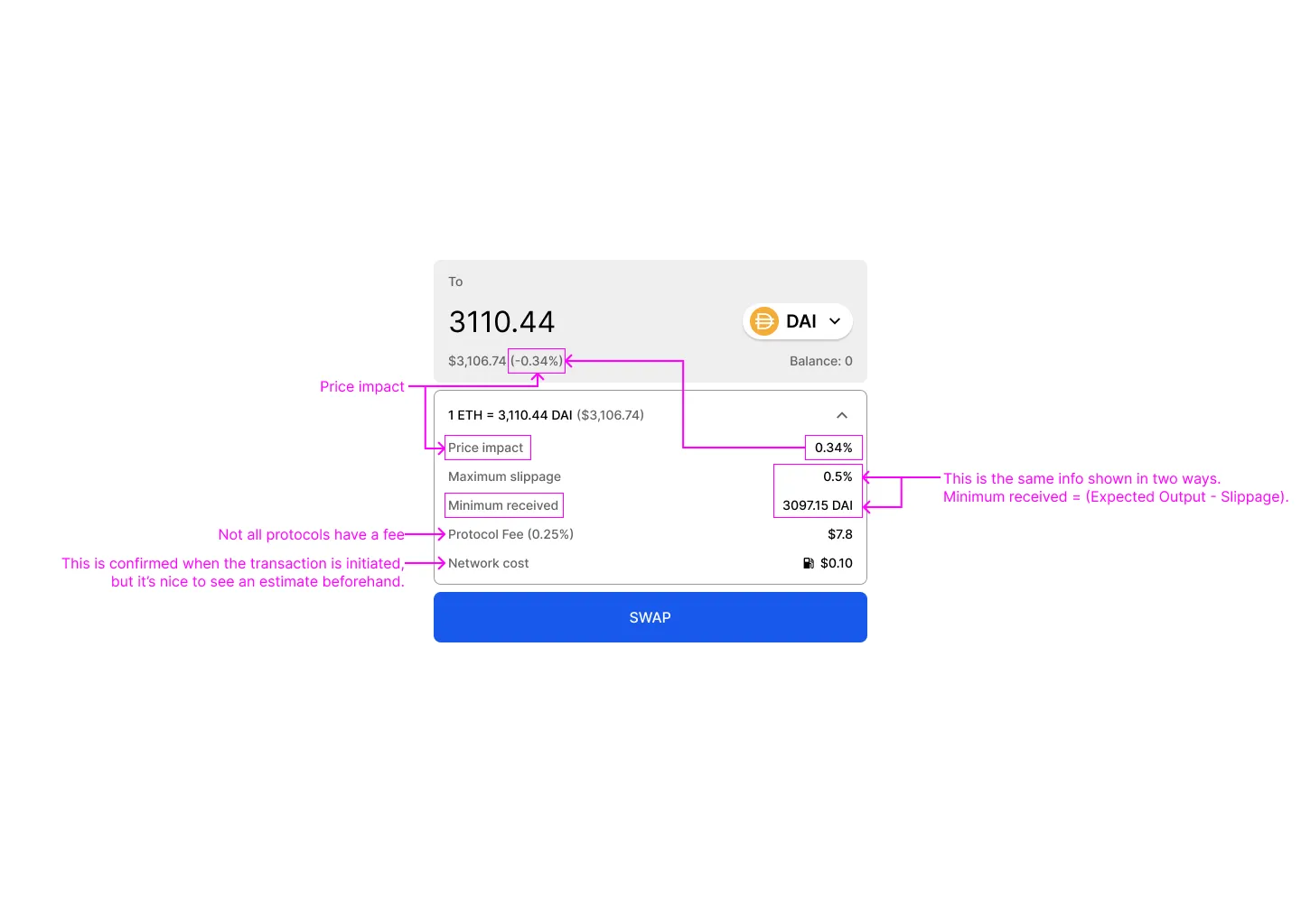
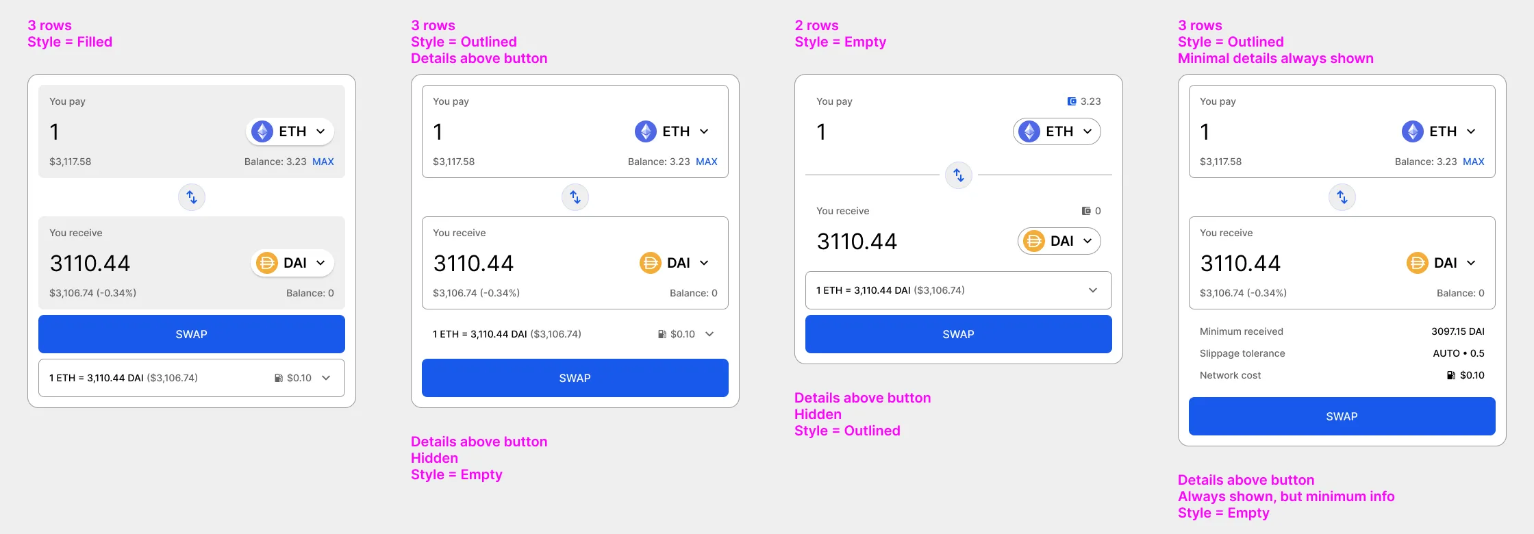
Exchanges have added details over the years, and some say the same thing twice. Slippage and minimum received are two sides of one number. Price impact often appears next to the received amount, again in the details panel, and a third time on a preview screen. Most people swapping small amounts enter a number and press Swap, so the details are for experienced traders and can be kept minimal or folded away.
Which side the token goes on
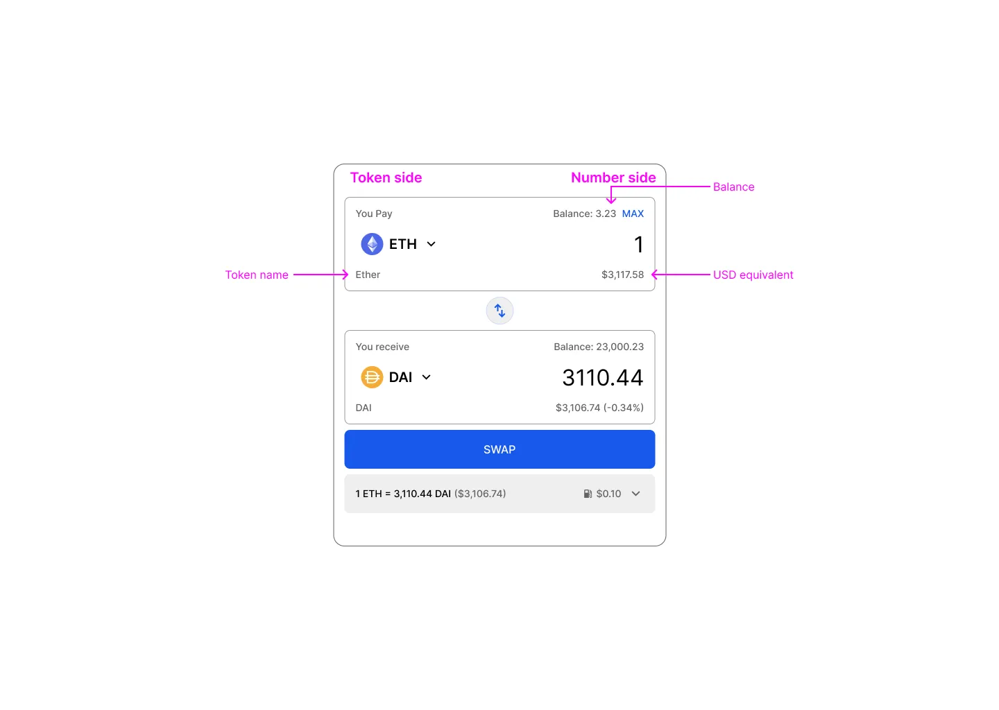
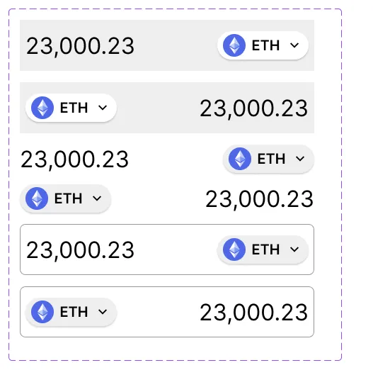
Uniswap first put the token on the left, then moved it to the right; SushiSwap did the same, and most exchanges have followed. The article explains why the change makes sense. We write “$50” but say “50 dollars”, so a number followed by its token reads naturally from left to right. And the balance belongs next to the token it describes, which is easier when the token is on the right. Tokens on the left look more symmetrical, but break that link.
One button that does the work
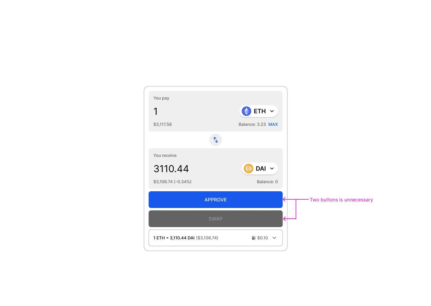
Before an exchange can move your tokens, you have to approve it in a separate wallet transaction. Many exchanges give that step its own button, so someone who came to swap finds an Approve button and a Swap button, and their wallet opens twice.
The button should say what the user came to do. Pressing Swap starts the approval as the first step, and a small panel shows progress. The same button can also explain what is in the way and fix it. On the wrong network it reads “Switch to Ethereum”, and pressing it switches the network; with no wallet connected it reads “Connect wallet”. It is a pattern that is unusual outside web3, but it saves space and keeps attention on the form.
The kit
A kit to build with
The DEX article ends with a wireframe kit, published free on Figma Community. Every part comes in three styles (empty, outlined and filled), with the token on either side and the details panel open or closed, so a team can try the layouts the article describes before choosing one. It includes eight example layouts.
Read